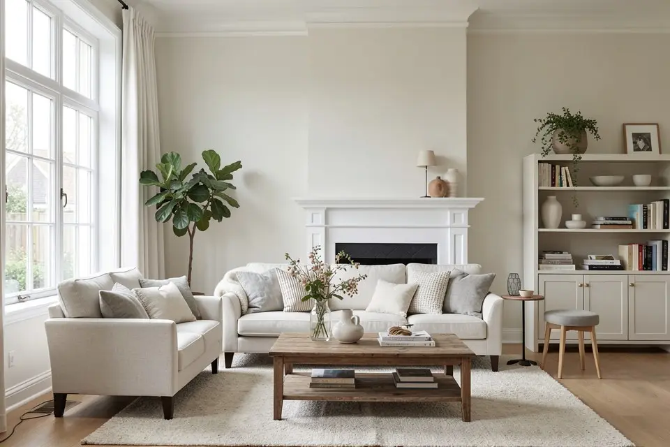
Choose a paint colour by its undertone and its light reflectance value, not by the name on the chip, and never decide from fewer than three samples painted on the actual wall and viewed at three times of day. That process costs about €15–€25 in sample pots and saves the €200–€600 repaint that follows a colour chosen in the shop.
The shop is the worst place to choose a colour. The lighting is cool, bright and even; your room is warm, dim and uneven. A colour that reads as calm greige under shop lights is often lilac at 4pm on your north wall.
Undertones are the whole game
Every paint colour has a mass tone — the obvious colour — and an undertone, the colour it leans toward that only shows against something else. Two “warm whites” can lean yellow and pink; two “greys” can lean blue and green. The undertone is what clashes with your floor, and it is invisible on the chip alone.
How to read it:
- Compare, never assess alone. Lay 3–5 chips of the same family on a sheet of pure white printer paper. The leaning becomes obvious in seconds: one grey goes violet, one goes green, one goes blue.
- Hold the chip against the fixed finishes. Floor, worktop, tiles, the sofa you are keeping. The wall colour has to get along with these, not with the chip next to it in the fan deck. A pink-leaning white against a yellow oak floor turns peach.
- Check the deepest colour on the strip. Paint strips run from pale to saturated; the bottom chip shows the undertone the pale one hides. If the darkest chip is clearly green, the palest one is green too, however “neutral” it looks.
The practical rule: match the undertone temperature to the floor. Warm floors (oak, terracotta, honey pine) want warm-leaning walls — yellow, red or orange undertones. Cool floors (grey tile, whitewashed boards, concrete) take cool-leaning walls. Mixing temperatures is possible but has to be deliberate, and most accidental mixes look like a mistake. If you are also picking a scheme for the bedroom, the bedroom colour ideas post applies the same undertone logic to the one room where getting it wrong keeps you awake.
Test in the actual light
Light changes colour more than anything else in the room.
- North-facing rooms get cool, blue-grey light all day. Cool colours go colder and flatter; a pale grey reads as cold concrete. Choose warmer undertones and go one step lighter than you think.
- South-facing rooms get warm light and lots of it. Most colours look good; warm colours can tip into yellow. You can go darker here than anywhere else.
- East-facing rooms are warm in the morning and cool by afternoon; west-facing the reverse, with a strong orange cast at 6pm. Choose for the time you use the room.
- Artificial light matters at night. Most homes run 2700 K bulbs, which push every colour warmer; a cool grey chosen at noon can read beige at 9pm.
Which is why the sample must be viewed at three times: morning, mid-afternoon and under lamps at night. A colour only has to be right for the hours you are in the room, but it has to be tolerable for all of them.
Use the LRV number
Light Reflectance Value runs from 0 (black) to 100 (pure white) and tells you how much light the colour bounces back. Most manufacturers print it on the chip or list it online.
- LRV 70–85: off-whites and very pale tints. Bright, airy, forgiving. Most ceilings and most small rooms live here.
- LRV 50–70: light mid-tones. Enough colour to notice, still reflective. The safe range for living rooms and hallways in most homes.
- LRV 30–50: true mid-tones. Cosy in daylight, dim at night unless the lighting is good. Needs the three-height lighting from how to redesign any room to work after dark.
- LRV under 30: dark. Dramatic, and only successful when the whole room commits and the lighting is layered. A dark accent wall is the low-risk way to try this range.
Two useful rules: in north-facing rooms add 10–15 LRV points to whatever you liked in the shop, and keep the ceiling at least 10 points higher than the walls unless you want the room to feel shorter.
The 3-sample rule
One sample is not a test; it is a guess with a brush. Three is the minimum, and the three should be close relatives, not three different colours.
- Pick the colour you think you want.
- Take the same colour one step lighter and one step warmer or cooler, depending on which way your light pushes it.
- Paint each as a 50 × 50 cm patch, two coats, on two different walls — one near the window and one opposite. A patch on the sunlit wall and the same patch in the corner will look like two colours, and you need to accept both.
- Paint patches on white primer or on large white card (A2 sample boards), not over the old colour, which tints the sample.
- Live with them for 48 hours. Look at 9am, 2pm and 9pm. Photograph them at each time with the same phone setting; the photos remove your mood from the decision.
- Choose the one you stopped noticing. The colour that keeps catching your eye is usually the one that will annoy you in a month.
Budget €5–€8 per sample pot and one hour of work. If none of the three works, you have learned which direction to move — that is a success, not a failure.
Mistakes with white
White is the hardest colour to choose because there are hundreds and every one has an undertone.
- Choosing pure white by default. Brilliant white (LRV around 90) is blue-leaning and looks clinical against anything warm. In most homes an off-white with LRV 80–85 reads as “white” in daylight without the chill.
- Matching wall white to trim white. Trim in brilliant white next to off-white walls makes the walls look dirty. Either use the same white on both or make the trim deliberately darker.
- Ignoring the floor. A grey-leaning white on honey pine goes dingy; a yellow-leaning white on grey tile goes cream. Pick the white that shares the floor’s temperature.
- Testing white alone. White on a white wall tells you nothing. Test it beside a chip of brilliant white and its undertone appears immediately.
- Painting a north room stark white to brighten it. It goes grey and flat. A warm off-white at LRV 75–80 brightens a north room better than a colder, higher-LRV white.
Preview the colour on your own room photo first
Before buying a single sample pot, shortlist digitally. Photograph the room in daylight, floor and two walls in frame, and run it through a colour-change tool — Homie’s Room Redesign or its paint-palette generator does this from one photo and returns the palette with the render. The paint palette method explains how to pull a coherent wall, trim and accent set from that result rather than picking three colours you happen to like.
This does not replace the physical test; a render cannot know your bulb temperature or your north light. What it does is narrow forty candidates to three in ten minutes, so the three sample pots you buy are the right three. Then, once a colour is chosen, the interior painting cost guide tells you what putting it on the walls will cost, DIY or with a decorator.
The short version
- Match the undertone to the floor.
- Test in your light, morning, afternoon and night.
- Use LRV to set brightness; add 10–15 points in north rooms.
- Three samples, 50 × 50 cm, two walls, 48 hours.
- Never choose a white without a brilliant-white chip beside it for comparison.
- Preview on a photo first so the samples you buy are the right ones.