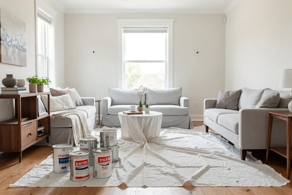
LRV (light reflectance value) is the percentage of visible light a paint colour reflects, measured on a scale from 0 to 100. Absolute black is 0 and a perfect white is 100; real paints sit between about 3 (the blackest blacks) and 94 (the brightest whites). An off-white with LRV 85 bounces back 85 percent of the light that reaches it — which is why the same lamp lights a white room and a navy room so differently.
Manufacturers print the LRV on the back of the swatch card or on the colour’s page online. It is the most useful number on that card, and the one most people skip.
How LRV is measured
LRV is measured with a spectrophotometer under a standard daylight illuminant. Technically it is the colour’s luminance (the CIE Y value), weighted by how sensitive the human eye is to each wavelength. That weighting matters: a saturated yellow and a saturated blue can look equally “strong”, but the yellow has a far higher LRV because the eye sees yellow-green light as brighter.
LRV says nothing about hue or undertone. A warm greige and a cool grey can share the same LRV and look completely different on the wall; for that half of the decision, see how to choose paint colours by undertone.
Typical LRV values
| Colour type | Typical LRV | How it reads on a wall |
|---|---|---|
| Brilliant white | 90 – 94 | Crisp, slightly blue next to anything warm |
| Off-white, soft white | 80 – 88 | Bright but not clinical; the safe ceiling choice |
| Pale greige, light beige | 65 – 78 | Light with a visible colour |
| Light sage, pale blue | 50 – 65 | Clearly a colour, still airy in daylight |
| Mid grey, terracotta, dusty green | 25 – 45 | Cosy by day, dim at night without lamps |
| Deep green, charcoal | 8 – 20 | Dark and enveloping |
| Navy, black | 2 – 8 | Absorbs almost all light |
Why LRV 50 isn’t the middle
The eye is not linear. It is far more sensitive to differences between dark colours than between light ones, so the perceived midpoint between black and white is at LRV 18 – 20, not 50. A colour with LRV 50 already looks clearly light — around three quarters of the way to white. That’s why a “mid-tone” chosen at LRV 50 often looks paler on the wall than expected, and why a colour at LRV 30 can feel surprisingly dark in a north-facing room.
Using LRV to choose paint
- Bright rooms: LRV 60 – 85 on walls, 80+ on the ceiling. Most of the shades in paint colours for every room sit in this band.
- North-facing rooms: add 10 – 15 points to whatever you liked in a sunny room. Cool, weak light flattens colour and makes it read darker.
- Small rooms: a high LRV doesn’t make a room bigger, but it removes shadows from corners, which is most of what “feels small” means.
- Bedrooms and snugs: going deliberately dark (under 25) works when the whole room commits — walls, and often woodwork and ceiling too. Bedroom colour ideas has both directions.
- Kitchens: cabinet colours under LRV 20 show every fingerprint and swallow under-cabinet light; kitchen cabinet colour ideas covers which dark shades still work.
LRV and contrast: accessibility
LRV is also how designers measure contrast for people with low vision. British guidance (BS 8300 and Approved Document M) asks for a difference of at least 30 LRV points between surfaces that need to be told apart: wall and floor, door and wall, a handrail and the wall behind it. A white door (LRV 85) in a pale greige wall (LRV 70) only differs by 15 — easy to miss for someone with poor eyesight. Painting the door or its frame at LRV 40 fixes it.
LRV outside: heat and siding
Dark exterior colours absorb more sunlight and get hotter. On masonry that matters little, but vinyl and composite cladding can warp: many siding manufacturers set a minimum LRV — often around 50 – 55 — or sell special heat-reflective dark colours. Check before you paint, and see how to choose exterior paint colours and the siding ideas guide for colours that age well outdoors.
LRV also affects how much paint you need: going from a dark colour (LRV under 20) to a light one (over 70) usually needs a primer or a third coat, which what it costs to paint a room builds into the budget.
Build a palette with the numbers
A palette is easier to live with when the LRVs are spread out: a light main wall colour (70 – 85), a mid-tone for joinery or one wall (35 – 55), and a dark accent (under 20). Homie’s Color Palette tool pulls a matching palette from a photo of your room — how to generate a paint colour palette shows the steps — and you can then look up each colour’s LRV with the manufacturer before buying samples.
 Homie