The right paint colour for a room depends on three things you can check before you open a single tin: which way the window faces, when you actually use the room, and how hard the walls get treated. Get those three right and the colour choice shrinks to a handful of tones per room. This guide goes through the eight rooms most homes have, then the rule that makes them work together.
Three numbers to know before you pick
Light reflectance value (LRV). Every paint chart lists it, on a scale from 0 (black) to 100 (pure white). It tells you more about how a colour will behave on the wall than the chip does. Roughly:
- LRV 70–85 — whites and pale neutrals. Bounce light, make rooms feel larger.
- LRV 45–70 — mid tones. Hold their colour in most light, the comfortable middle.
- LRV below 40 — deep tones. Absorb light, make a room feel enclosed and intimate.
Window orientation. North-facing rooms (in the northern hemisphere) get cool, even light all day and pull every colour toward grey — warm the choice up a step. South-facing rooms get warm, strong light that can bleach pale colours and make warm ones look orange — cool the choice down a step. East rooms are bright in the morning and flat by afternoon; west rooms are the reverse.
Undertone. Two greys with the same LRV can look completely different once one leans green and the other leans violet. If you only read one other guide before buying, make it how to choose paint colours by undertone — it is the step most room-by-room advice skips.
Room by room
Living room
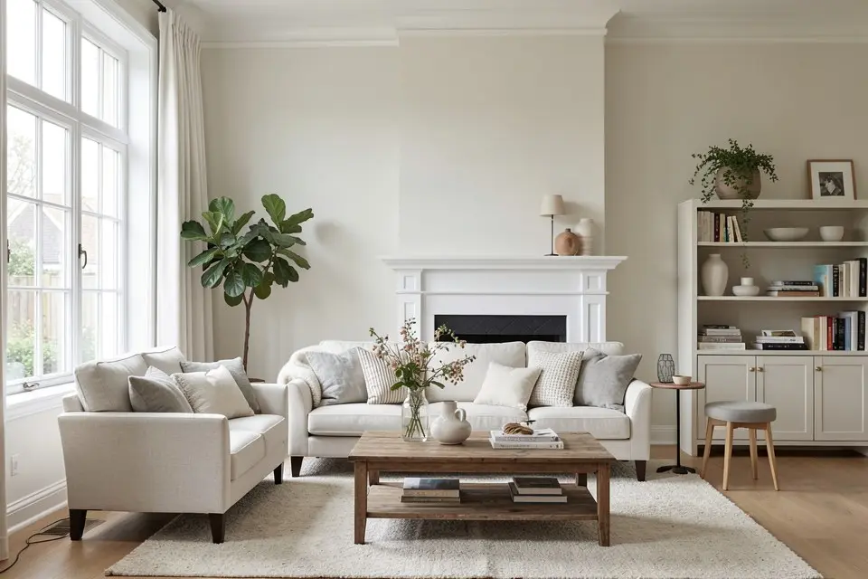
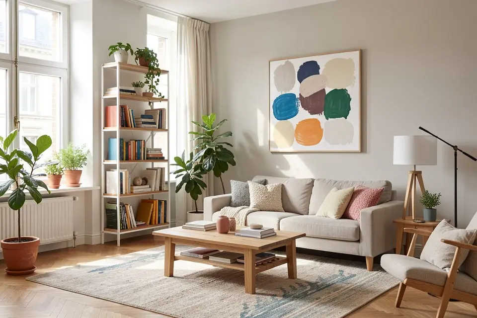
The living room is used across the whole day and lit by lamps at night, so it needs a colour that works in both. Mid-light warm neutrals in the LRV 55–75 range — greige, warm stone, soft clay — are the safest starting point. If the room faces north, go warmer; if it faces south and gets glare, a greyed green or soft putty calms it down.
Sheen: matt. It hides wall imperfections, and living-room walls rarely get scrubbed. A deep colour works here too, but only when the lighting is layered — a dark wall under a single ceiling light looks like a hole. The living room lighting plan covers the three layers you need before going dark.
Bedroom
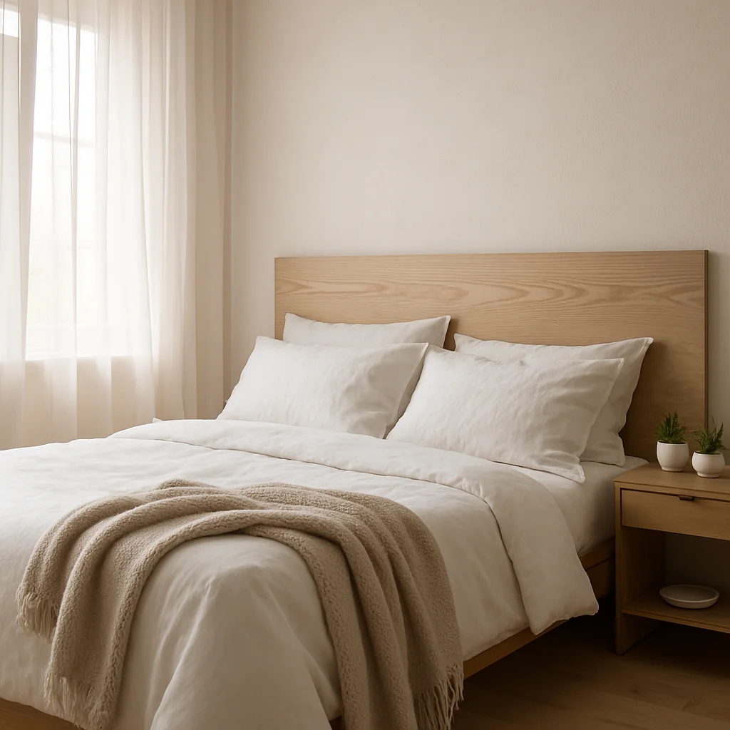
The bedroom is the one room seen mostly in the early morning and late evening, so daytime looks matter least. Muted, slightly greyed colours — dusty blue, sage, mushroom — in LRV 40–60 make the room feel enclosed at night without feeling heavy. For a small bedroom, reverse that: one pale warm colour on walls, trim and ceiling. The full set of goal-based palettes is in bedroom colour ideas.
Sheen: matt or flat. The low reflection keeps lamp light soft.
Kitchen
Kitchens already have a lot of colour from cabinets, worktops and splashbacks, so the walls usually play the supporting role. Choose the wall colour after the cabinets, not before: a warm white or a pale tone pulled from the worktop is almost always right. If you are repainting fronts as well, start with kitchen cabinet colour ideas and pick the walls to match.
Sheen: satin or a scrubbable kitchen-and-bath matt. Grease and splashes come off without polishing a shiny patch into the wall.
Bathroom
Most bathrooms are small, often windowless, and lit by cool overhead light. Pale colours in LRV 70+ keep them from feeling like a cupboard, but pure brilliant white under a cool LED can look clinical. A warm white, pale sea green or soft plaster pink is kinder to skin tones in the mirror — which matters more here than in any other room.
Sheen: a dedicated bathroom paint with mould resistance, usually satin or soft sheen. Ordinary matt emulsion blisters in a room with a shower and poor ventilation.
Home office
You need focus by day and video calls that do not make you look ill. Greyed greens and soft blues in LRV 50–65 are restful for long hours; avoid strong yellow and saturated red, which get tiring at eye level. Paint the wall behind your desk camera a mid tone rather than white — a white background makes webcams underexpose your face.
Sheen: matt or eggshell.
Hallway
Hallways get the least daylight and the most knocks. They are also the room that connects all the others, so they should carry your base neutral (see the flow rule below). Pick a pale warm tone around LRV 65–80 so the space does not feel like a tunnel, and use a darker, tougher colour on the lower third if bags, bikes or dogs keep marking it.
Sheen: eggshell or a scrubbable matt on walls, satin on skirting and doors.
Kids’ room
Children outgrow a bright theme within a few years, and saturated colours over large areas make small rooms feel busy. Keep the walls in a soft, flexible base — pale sage, warm sand, light terracotta — and put the strong colour somewhere easy to repaint: one wall, a painted arch behind the bed, or the lower half of the walls. The accent wall ideas guide covers where a single strong wall works and where it splits the room.
Sheen: scrubbable matt or eggshell. Crayon has to come off.
Dining room
Dining rooms are often used mainly in the evening, which makes them the best room in the house for a deep colour. Deep green, aubergine, inky blue or warm brick in LRV 10–30 look rich under pendant light and make the table the bright centre of the room. If the dining area is part of an open-plan space, use that deep colour only on a defined zone — a wall or an alcove — rather than on every wall.
Sheen: eggshell. It cleans well and gives deep colours a soft depth.
The whole-house flow rule
Rooms that you see from one another need to look like they belong to the same house. The simplest way:
- Choose one base neutral for hallways, landings and every room you can see through an open door. One colour, one undertone.
- Give two or three rooms their own colour, all from the same undertone family as the base — warm with warm, cool with cool.
- Keep trim, doors and ceilings consistent throughout, usually one white or one very pale version of the base.
That gives you a palette of four or five colours for the whole home rather than a different idea in every room. The paint palette method shows how to build that set from one photo or one starting colour. If you want to see the base and the accent colours side by side before buying samples, the Color Palette tool in Homie generates a matched set from a room photo.
Mistakes that cost a repaint
- Choosing from a chip under shop lighting. Buy sample pots (€5–10 each), paint a 60 × 60 cm patch on two walls, and look at it in the morning, afternoon and under lamps.
- Ignoring the floor. A cool grey wall over a honey-coloured oak floor fights it in every room. Match the wall undertone to the floor first.
- Painting a north room cool grey. It looks elegant on the chart and cold on the wall.
- Picking the bright white. Most rooms look better in an off-white with a small amount of warmth; pure white shows every shadow and dirty fingerprint.
- Using one sheen everywhere. Matt in a bathroom fails within a year; gloss on a living room wall shows every dent.
- Forgetting the cost of coverage. Deep colours over pale walls, or pale colours over dark ones, often need a primer and a third coat. Check the numbers in the interior painting cost guide before you commit.
A short checklist per room
Before buying, write down for each room: window direction, main hours of use, LRV range you are aiming for, undertone family, and sheen. Five lines per room is enough to stop most mistakes, and it makes the conversation with a painter — or the trip to the paint counter — much faster.