Choose a living room colour after you have looked at three things you are not going to change — the floor, the sofa and the direction the window faces — and most of the palette decides itself. The living room is the room you see in every light: grey morning, full afternoon sun, and four hours of lamplight in the evening. A colour that only works in one of those is the wrong colour.
Start with what the room has to do
Living rooms do more jobs than bedrooms, so it helps to name the main one before looking at a single swatch:
- Calm. It is where you unwind in the evening, and the TV or a reading chair is the centre of the room.
- Sociable. You host often, the room is busy in the daytime, and it needs to feel lively without being loud.
- Bigger. The room is under about 16 m², the ceiling is low, or the furniture already fills it.
- Warmer. The window faces north or looks onto a wall, so the room is cool and grey for most of the day.
Pick one. Calm points to muted mid-tones with grey in them; sociable to warm, slightly earthy colours; bigger to one pale colour on every surface; warmer to yellow- or red-based neutrals. If you are rethinking the whole room rather than just the walls, the living room redesign guide covers the order — layout, then colour, then lighting — and why painting first is usually the right call.
Colour by window direction
Window direction changes a living room colour more than any other factor, because you see the walls in daylight for hours.
- North-facing. Cool, flat, even light. It drains warm colours a little and turns cool ones grey. Choose warm whites with a yellow base, camel, warm greige, soft terracotta or a muted ochre. Avoid blue-grey and anything with green in the white.
- South-facing. Strong, warm light that shifts all day. Almost anything works, and cool colours finally look as intended: dusty blue, grey-green, a cool off-white. Very warm colours can feel hot by mid-afternoon.
- East-facing. Bright and warm in the morning, cooler and dimmer by the evening, which is when most living rooms are used. Pick for the evening: mid-warm neutrals, sage, clay.
- West-facing. Grey in the morning, deep orange at sunset. Neutrals with a slight grey base keep the golden hour from turning the room amber.
Whatever the direction, the evening light comes from your lamps, not the window. A muted green that looks perfect at noon can look muddy under cool LED bulbs; plan the bulbs with the living room lighting plan and check samples with those lamps switched on.
The sofa, floor and wood decide more than you think
Paint is the cheapest and easiest thing in the room to change, so it should be chosen to suit the expensive things, not the other way round.
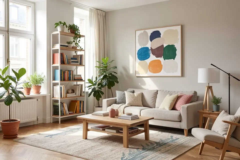
The floor. It is the largest surface after the walls. Warm oak and honey-toned floors push towards warm walls; a cool blue or icy grey next to orange-toned oak makes both look wrong. Grey or whitewashed floors are more flexible, but they make warm walls look yellower. Read the undertone of the floor first, as described in the guide to paint undertones, and pick a wall colour with the same undertone.
The sofa. A neutral sofa (grey, oatmeal, beige) leaves you free. A coloured sofa — green velvet, rust, navy — is effectively your accent already, so the walls should step back: a warm white behind a green sofa, a pale greige behind rust. Do not match the wall to the sofa; take the wall two steps lighter, or the sofa disappears.
Wood furniture. A sideboard, a dining table in view, a timber ceiling or a shelf unit all add a second warm tone. If you already have two or three different woods, a quiet wall helps them get along; how to make several wood tones work together is covered in how to mix wood tones.
Six palettes, three tones each
Each palette is a wall colour, a trim-and-ceiling colour, and an accent used no more than three times — in a cushion, a piece of art and one object or textile.
- Warm calm — soft putty walls / warm white trim and ceiling / deep olive in a cushion, a vase and a print.
- North room — warm clay or pale terracotta walls / cream trim / ink blue in one armchair and a throw.
- Bright and social — warm white walls / the same warm white on trim / burnt orange or ochre in cushions, a rug border and art.
- Cool south room — dusty grey-blue walls / soft off-white trim / cognac leather and brass, used sparingly.
- Green evening room — muted sage walls / sage trim one step deeper / walnut and black in the lamps and frames.
- Small room, one colour — pale greige on walls, trim, ceiling and radiator / no contrast trim at all / charcoal in the curtain pole, lamp and picture frames.
Palettes 1 and 5 suit the calm goal, 3 the sociable one, 6 the “bigger” goal, and 2 a north-facing room; 4 works when a south-facing room needs cooling down. If you want to see two or three of these on your own walls before buying samples, the Color Palette tool in Homie applies a palette to a photo of your room, and Style Transfer does the same for a whole style.
Small and dark living rooms
Small rooms have two honest options, and both rely on removing contrast:
- Light and continuous. One pale, warm colour on every surface, including the ceiling and the door. The fewer edges the eye can count, the bigger the room reads. Avoid bright white trim against coloured walls.
- Dark and enveloping. One deep colour — forest green, aubergine, inky blue — on walls, trim and ceiling. The corners disappear and the room feels intentional rather than cramped. This works best in rooms used mostly in the evening.
What does not work is the half-measure: a white small room with one dark wall. Layout matters as much as paint in a tight space, and the small living room layout guide covers sofa size, clearances and what to leave out.
For a dark room with little daylight, resist the urge to paint it brilliant white. Without light to bounce, bright white just looks grey. A warm mid-light tone looks brighter in a dim room than a cold white does.
Open-plan transitions
In an open-plan space, the living area rarely gets its own colour. Three rules keep it coherent:
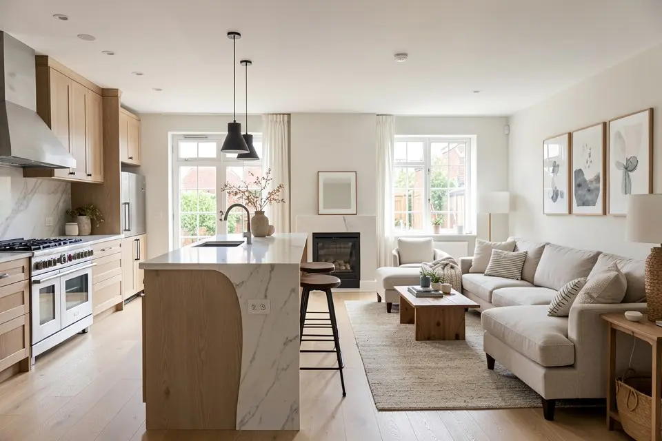
- Keep one trim colour everywhere. Skirting, door frames and window reveals in the same colour stitch the zones together.
- Change colour only at a corner, a door frame or a change of ceiling. Never in the middle of a flat wall.
- Stay in one family. A deeper version of the kitchen wall colour in the living zone reads as a choice; two unrelated colours read as two flats.
The furniture and zoning side of the same problem — rugs, sofa backs, lighting circuits — is in the open-plan kitchen and living layout guide.
Feature walls, ceilings and finish
A feature wall works in a living room more often than in a bedroom, but only behind the main focal point (the sofa, the fireplace, or the media wall) and only in a colour from the same family as the rest of the room. The rules and the failure cases are in accent wall ideas.
For ceilings, pale walls can take a white ceiling; mid or dark walls need the ceiling in the same colour or a noticeably lighter version of it, or the white ceiling sits on the room like a lid. Use matt or eggshell on walls — living rooms catch a lot of lamp reflections — and a satin on trim if it gets knocked often.
Mistakes that show up in every living room
- Choosing from a phone screen. Paint a sample at least 60 × 60 cm, on the wall opposite the window and on the darkest wall, and look at it in the morning, afternoon and evening.
- Too many colours. Walls, trim and one accent. The sofa, rug and curtains already add colour.
- Cool grey “because it’s neutral”. In most living rooms grey looks flat in the evening; a warm greige does the same job without the chill.
- Ignoring the next room. A colour that works alone can clash with the hallway visible through the door. Look at both together before you commit.
- Forgetting the cost of dark colours. A deep tone usually needs a tinted primer and an extra coat; for a typical 20 m² living room that adds roughly €40–€80 and half a day. The full breakdown is in the interior painting cost guide.