Mixing wood tones works when one wood clearly leads, the others are either clearly lighter or clearly darker than it, the undertones agree, and each tone appears at least twice in the room. It fails when two woods are nearly the same colour, because the eye reads “almost matching” as a mistake, not as a choice. Most rooms that feel off with wood in them are not suffering from too many woods — they are suffering from two woods that are too close.
The good news: matching everything is not the goal and never was. A room with one wood species on the floor, the table, the chairs and the shelves looks like a showroom package. A room with three well-chosen woods looks collected over time, which is the effect most people are trying to buy.
Step 1: Find the dominant wood
Every room has a wood that covers the most surface. In most homes that is the floor. In a room with carpet or tiles, it is the largest piece of furniture — a dining table, a wardrobe, a wall of shelving, or kitchen cabinets.
That dominant wood is fixed. Everything else is chosen relative to it. Write down three things about it before you buy or move anything:
- Depth: light (birch, ash, white oak, pine), medium (natural oak, teak, cherry when young), or dark (walnut, wenge, stained mahogany, smoked oak).
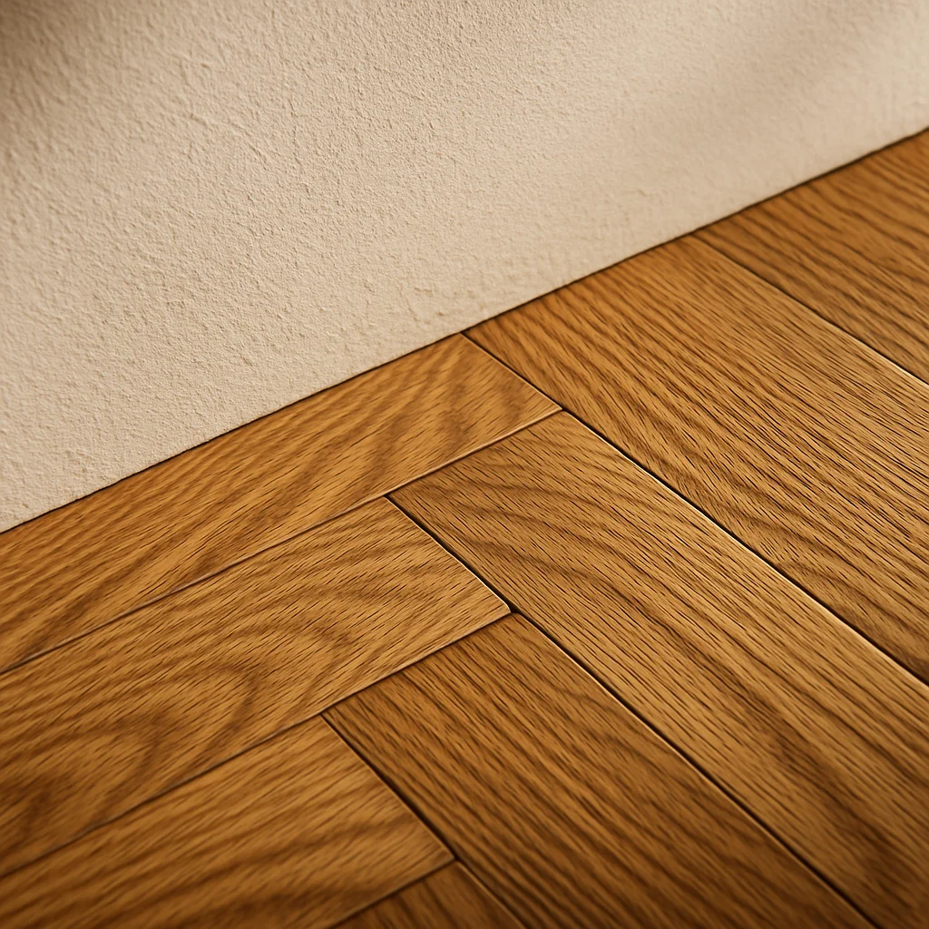
- Undertone: warm (yellow, orange, red), neutral (beige, true brown), or cool (grey, ash-washed, some fumed finishes).
- Grain: quiet (maple, birch, beech) or loud (oak with strong ray fleck, ash, zebrawood, knotty pine).
A quick way to check undertone: hold a sheet of white printer paper flat against the wood in daylight. Next to the white, warm woods turn visibly yellow or orange, cool woods go greyish, and neutral woods just look brown. It is the same trick used for choosing paint by undertone, and it works for the same reason.
Step 2: Keep the undertones on the same side
Depth can vary a lot; undertone should not. A pale honey pine floor, a medium teak sideboard and a dark walnut coffee table all have warm undertones, and they sit together easily despite the range from light to dark. A grey-washed oak floor with a red cherry dresser is only two woods, but it looks wrong because one is cool and one is warm.
Rules of thumb that hold up:
- Warm with warm is the easiest mix. Most traditional, mid-century and farmhouse rooms live here.
- Cool with cool works but needs texture elsewhere — linen, wool, plants — or it goes flat and cold.
- Neutral woods (natural white oak, walnut with a clear oil) are the diplomats. They sit next to either side.
- Warm plus cool only when the minority wood is under about 15% of the visible wood in the room: a stool, a picture frame, one side table.
Orange is the undertone that causes the most trouble. Golden oak and orange pine from the 1990s fight almost every modern wood. If that is your floor, lean into warm walnut and teak rather than trying to cool it down with grey pieces.
Step 3: Make the contrast obvious
This is the step that fixes most rooms. Two woods should be either close enough that they are effectively the same (the same species and finish), or far enough apart that nobody could think you tried to match them.
A practical test: take a phone photo of the two woods side by side and turn it black and white. If you can barely tell where one wood ends and the other begins, they are too close. You want a visible jump in grey value, roughly the difference between a light oak and a medium teak, or a medium oak and a walnut.
Pairings that almost always work on a mid-tone oak floor:
- Walnut for the sofa-side furniture — a coffee table, a media unit. Two full shades darker, same warm-neutral family.
- Ash or birch for chairs and shelving. Lighter, quieter grain.
- Black-stained or ebonised wood for one accent — a stool, frames, a lamp base. It works as punctuation rather than a third wood.
Pairings that usually go wrong: oak furniture on a slightly different oak floor, cherry next to mahogany, and pine next to golden oak. All three are too close in depth and not the same in colour.
Step 4: Repeat every tone at least twice
A single piece in a wood that appears nowhere else looks like it came with the previous tenant. The same piece looks intentional when its tone shows up once more, somewhere across the room.
If you have a walnut coffee table, add walnut picture frames, a walnut tray, or a walnut-legged chair on the opposite side. If you have a pale ash dining chair, repeat the pale tone in a shelf or a bread board on the counter. Small repeats are enough: a €25 frame does the same job as a €900 cabinet for this purpose.
Distribution matters as much as repetition. Put all the dark wood on one side of the room and the room tilts visually toward it. Spread each tone into a loose triangle — three points, roughly across the space — and the room balances.
Step 5: Separate the floor from the furniture
Wood furniture standing directly on a wood floor is the hardest combination, because the two are always seen together and the legs sit exactly on the line where they meet.
Three ways to make it easy:
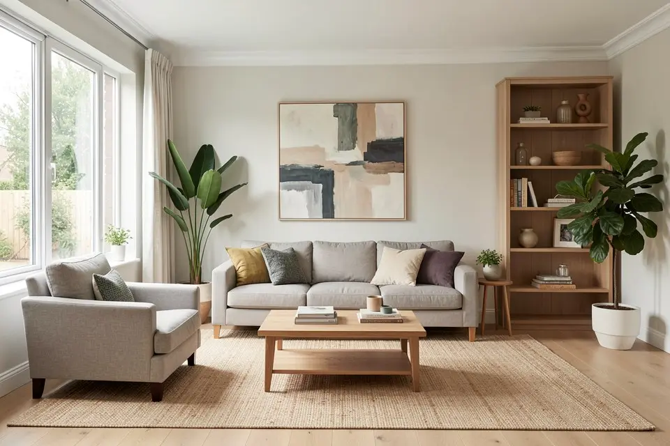
- A rug. The single most effective fix. A 200 × 300 cm flat-weave rug in wool or jute costs €120–€400 and puts a neutral field between the floor and the sofa, table and chairs. Pick a rug big enough that at least the front legs of every seat sit on it; the small living room layout guide has the sizing rules.
- Legs in a different material. A wooden tabletop on black steel legs, or a wooden chair with a painted frame, touches the floor with metal or colour instead of wood.
- Lift it. Wall-mounted shelves and floating media units never touch the floor, so they can be any wood without competing with it.
Step 6: Let grain do some of the work
Two loud grains next to each other — a knotty pine floor and a quarter-sawn oak table, for example — compete even when the colours agree. Pair one loud grain with one quiet one: a strongly figured oak floor with smooth walnut furniture, or a plain beech floor with a heavily grained ash table.
Finish counts here too. A matte, oiled wood next to a glossy, lacquered one looks like a deliberate contrast if the colours are clearly different, and like a mismatch if they are close. When in doubt, keep sheens similar and let colour carry the difference.
Step 7: Add non-wood neutrals as buffers
Woods look better with something between them that is not wood. Black metal, white paint, brass, cane, linen and stone all work as buffers and make each wood read as a separate, chosen material.
A simple way to plan a room with three woods:
| Role | Share of visible wood | Example on a mid oak floor |
|---|---|---|
| Dominant | 60–70% | The oak floor itself |
| Secondary | 20–30% | Walnut coffee table, media unit, frames |
| Accent | 5–15% | Pale ash chairs or a black-stained stool |
| Buffer (not wood) | — | Wool rug, black lamp, white walls, linen sofa |
If a room has four or more woods and still looks calm, it is almost always because the buffers are doing a lot of work — usually a large rug and pale walls.
Styles that tell you how far to go
Some interior styles have strong opinions about wood mixing, and knowing them saves you from fighting the room:
- Scandinavian: mostly one pale wood, with a second darker wood as a small accent. Contrast is gentle.
- Japandi: pale oak or ash plus a dark stained wood, often in the same room, with very little in between. Contrast is high but the palette is short.
- Mid-century modern: teak and walnut together, warm-on-warm, with medium-dark tones dominating.
- Farmhouse and rustic: reclaimed and knotty woods mixed freely. Here the mix is the point, and loud grain is welcome, but painted pieces keep it from becoming a log cabin.
- Minimalist: usually one wood, maybe two. If you want a strict minimalist room, the answer to “how do I mix wood tones?” is often “don’t”.
Fixing a room you already have
Most people are not choosing woods from scratch. They have a floor they cannot change, a table from a parent, and a bookshelf from a flat-pack store. A realistic order of fixes, cheapest first:
- Move pieces apart. Two clashing woods next to each other are much worse than the same two woods on opposite walls. Free.
- Add the buffer. Rug, throw, a table runner, a lamp in black or brass. €30–€400.
- Repeat the orphan. If one piece stands alone, give it a partner in the same tone with frames or accessories. €20–€80.
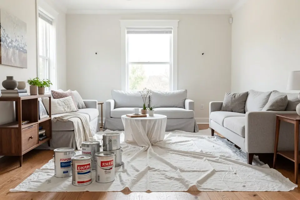
- Paint the troublemaker. The one piece that is too close to the floor, or has the wrong undertone, gets painted — black, deep green, or the wall colour. €40–€70 in materials and a weekend.
- Replace one piece. Only after the steps above, and only the piece that the black-and-white photo test says is the problem.
It helps to see the result before sanding or buying anything. Upload a photo of the room to Homie’s Room Redesign, pick a style, and compare how the same space looks with lighter or darker furniture on your existing floor. It will not match a specific product’s stain, but it is a fast way to see whether “go darker” or “go lighter” is the right direction for your room.
A worked example
A 4 × 5 m living room with a medium golden oak floor from the early 2000s. In it: a light grey-washed oak coffee table, a cherry TV unit inherited from a grandparent, and white flat-pack shelves.
The problems: the grey-washed table is cool against a warm floor, and the cherry unit is warm but only one shade away from the floor and redder than it.
The fix: the grey-washed table went to the bedroom and was replaced with a second-hand walnut table for €180. The cherry TV unit stayed, but a 200 × 300 cm oatmeal wool rug (€290) went down so the unit and table no longer sat directly on the oak. Walnut frames on the shelves repeated the table tone on the other wall, and a black floor lamp added a buffer between the unit and the window. Total: about €530, and the three woods — golden oak, cherry and walnut — now read as a warm, deliberate range instead of three near misses.