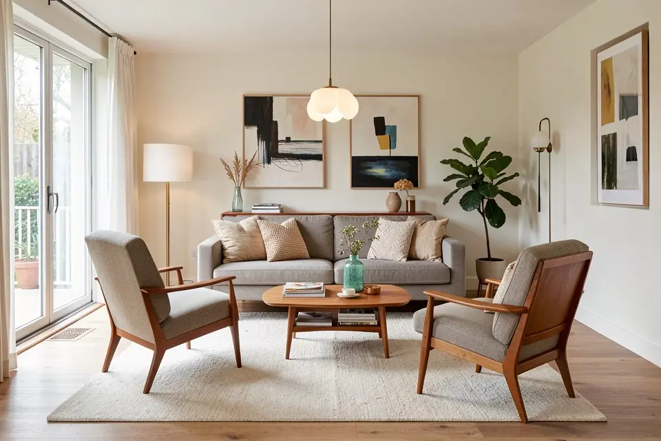
Mid-century modern is not “wood furniture with tapered legs” — it is a specific set of engineering decisions from 1945 to 1969 that prioritised honest materials, organic curves, and furniture that showed its own structure instead of hiding it under upholstery.
What the era was actually solving
Post-war housing was smaller, mass production was new, and designers like Eames, Saarinen, and Wegner were working with plywood-moulding and injection-moulding techniques for the first time. The look you associate with the era, thin legs, exposed joints, curved plywood shells, exists because those techniques made curved, lightweight furniture possible and cheap. Every visual signature has a manufacturing reason behind it. That is why furniture that copies the shape without the material honesty (chrome-plastic hairpin legs on a big-box veneer table) reads as a costume rather than the real thing.
The five markers
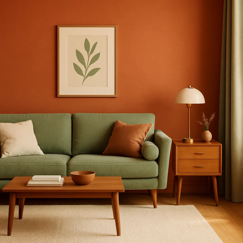
- Tapered, splayed legs. Never straight down, never turned or carved. The leg angles outward from the frame, usually in solid walnut or teak, often finished with a brass cap called a ferrule.
- Organic curves against straight lines. A kidney-shaped coffee table next to a rectilinear sideboard. The tension between organic and geometric is the visual signature, not uniformity.
- Exposed structure. Joints, stitching, and frames are visible rather than upholstered over. A chair’s wooden arm is not hidden under fabric.
- Saturated, specific accent colours. Not pastel, not neon: mustard, burnt orange, olive, teal. Usually one accent colour used in upholstery or a single wall.
- Function stated plainly. Storage pieces have visible drawer pulls, often recessed timber, rather than decorative hardware.
The palette
| Element | Colour |
|---|---|
| Walls | warm white, soft grey, or a mid-tone walnut-adjacent brown |
| Large furniture | walnut, teak, or black-painted steel |
| Accent | mustard, burnt orange, olive green, or teal — pick one |
| Metal | brass or black, never chrome and brass together |
Keep the accent to roughly 10% of the room: one chair, one set of cushions, or one piece of art. Two saturated accents fighting for attention is the fastest way to tip mid-century into a themed rental property.
Where it goes wrong
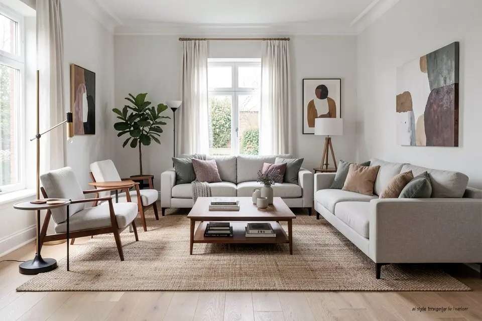
The most common failure is buying a single “MCM-style” sofa from a fast-furniture catalogue and putting it in a room with a grey sectional’s worth of everything else. The sofa alone does not carry the style; the legs, the wall colour, and the lighting have to agree. A tapered-leg sofa under a farmhouse pendant light with a shiplap wall looks like two different rooms photographed together.
The second failure is over-saturating: teal walls, orange sofa, and a starburst mirror all in one room reads as a themed diner rather than a home. Pick one dominant neutral and let the accent colour do the work in small doses.
Room by room
- Living room: a low sofa with exposed wood arms, a walnut credenza as the TV console, a single sculptural floor lamp (arc lamp or a tripod).
- Bedroom: a platform bed with a walnut headboard, nightstands with tapered legs, one saturated-colour throw.
- Home office: a walnut desk with hairpin or tapered legs, a task chair in leather or wool, open shelving instead of closed cabinets. This pairs well with the layout ideas in home office design ideas if you’re planning the whole room rather than just the furniture style.
- Dining room: an oval or boat-shaped walnut table, chairs with exposed frames (Eames-style shell chairs work), a single pendant light in brass or walnut.
Mid-century’s warm woods overlap with japandi, and the raw-material half of it feeds into industrial style; both guides explain where the lines are.
A worked example
A 4 × 5 m living room currently furnished in grey fast-furniture: grey sectional, glass coffee table, no wall colour beyond builder’s white.
The fix keeps the floor and the window as fixed points. The sectional is replaced with a lower three-seat sofa in a warm tan or olive boucle, legs tapered and visible. The glass coffee table is swapped for a walnut one with an organic, rounded top. One wall behind the sofa gets painted in a muted olive, following the accent wall rule of colouring the wall the seating backs onto, and a single arc floor lamp goes in the corner. Total furniture and paint spend for this room typically runs €1,800 to €4,500 depending on whether the sofa is vintage-sourced or new. If new, Shop the Look finds tapered-leg matches at several price points.
Try it yourself
If you’re weighing this style against something calmer, the walnut-and-curve formula sits at the opposite end from minimalist interior design, which strips out the sculptural furniture entirely. To see mid-century modern applied to your actual room, run Style Transfer in Homie with a photo of the space. It keeps your walls, windows, and floor exactly where they are, and swaps in the tapered-leg furniture, the walnut tones, and a single accent colour so you can judge the balance before spending anything.