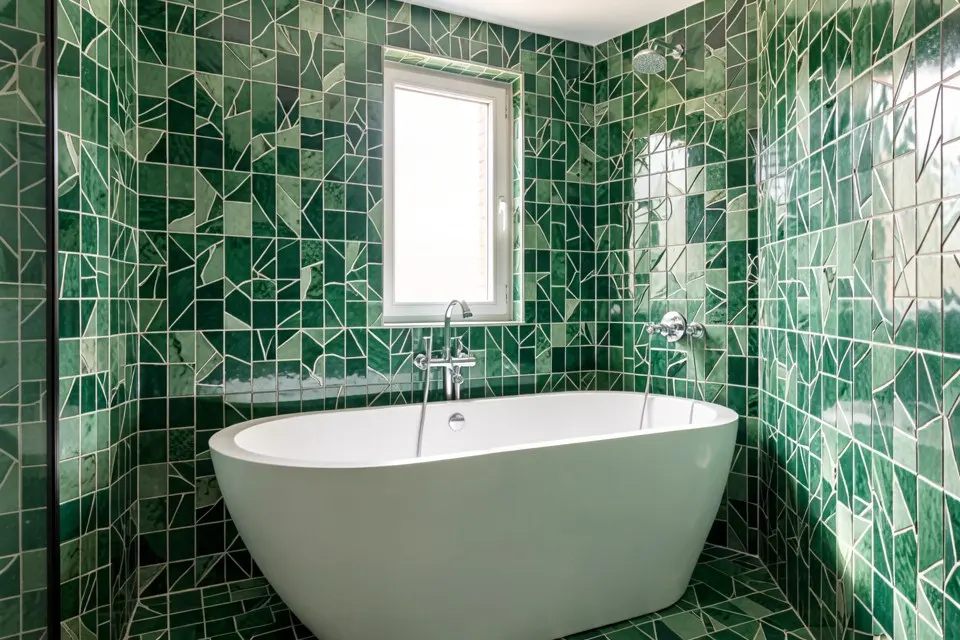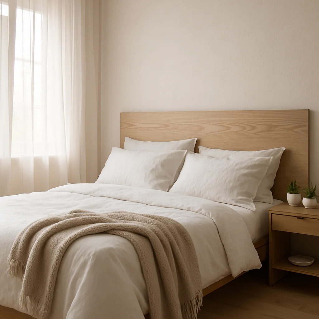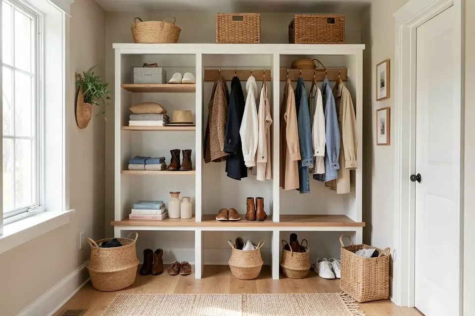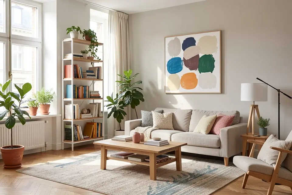
Color Palette extracts a coordinated color scheme from a photo, whether that’s your current room, a Room Redesign result, or a picture of something you like, and turns it into a usable set of paint directions.
Picking paint colors from scratch is one of the harder small decisions in any room project, mostly because color swatches lie. A chip that looks perfect under store lighting looks completely different on your wall at 7pm. Color Palette sidesteps some of that by working backward from an image you already know you like, rather than forward from an abstract swatch.
What it does differently from picking colors yourself
A person picking colors manually usually starts with one color they like and improvises the rest, which is how mismatched palettes happen. Color Palette instead analyzes the full image, the wall tones, the furniture, the light, and returns a palette that’s already internally coordinated because it was pulled from a single coherent scene rather than assembled color by color.
This makes it most useful right after a Room Redesign or Style Transfer result you like. You’ve already settled on a look; Color Palette turns that look into an actual buyable scheme instead of you eyeballing hex codes off a screenshot.
How to actually do it
- Start with a photo you want to pull colors from. This can be a finished Homie redesign, a photo of your current room, or any reference image with a color scheme you like.
- Open Color Palette in Homie and load the image.
- Review the palette it returns. It should break out roughly into a dominant tone, a secondary, and one or two accents.
- Assign each color to a real surface: dominant to walls, secondary to trim or large furniture, accent to cushions, art, or a single feature wall.
- Take the dominant and secondary colors to your paint brand’s color-matching tool, in-store or online, to find the nearest real swatch. Order a physical sample before committing to gallons, and check its undertone against the room’s fixed elements; how to choose paint colours by undertone explains what to look for.
- Test the sample on your actual wall in daylight and evening light before painting the full room. Digital and in-store lighting both distort color; your wall at home is the only honest test.
Turning a palette into a real room
| Palette role | Typical use | Share of the room |
|---|---|---|
| Dominant | Walls, ceiling | ~60% |
| Secondary | Large furniture, trim, cabinetry | ~30% |
| Accent | Cushions, art, one small feature | ~10% |
This 60/30/10 split is a reasonable default whenever a palette doesn’t come with its own guidance. It keeps a room from feeling either flat (all one color) or chaotic (every color at equal weight).
If you’re applying a palette to a full house rather than one room, keep the dominant consistent across connected spaces like a living and dining area, and let the accent shift room to room. This is the same logic that makes a transitional style house feel coherent from room to room without being monotonous.
Common mistakes
The most common mistake is trusting the on-screen color as the final answer and buying full cans without a physical sample. Screens render color inconsistently, and paint dries differently than it appears wet or on a chip. Always sample on the actual wall.
The second is applying too many of the palette’s colors at equal strength. A four-color palette doesn’t mean four walls in four colors; it means one dominant tone doing most of the work and the rest used in smaller doses.
The third is generating a palette from a photo with unusual lighting, like a strongly warm evening shot or a photo with a colored lamp on. The extracted palette will be skewed by that lighting and won’t represent the room’s true colors. Pull from a photo taken in even, natural daylight when possible, following the same principles as photographing a room for AI redesign.
What it costs to actually paint
A palette is free to generate. Painting the room is not. Budget for it using a guide like what it actually costs to paint a room before you commit to a scheme, since some palettes with the dominant on trim rather than walls, or with multiple accent colors, cost more in labor and materials than a simple single-color repaint.
Try it yourself
Take a photo you already like, your current room, a favorite piece of art, or a finished Homie redesign, and run it through Color Palette. Assign the resulting colors using the 60/30/10 split, sample before you buy, and you’ll have a scheme that’s coordinated by design rather than assembled color by color.